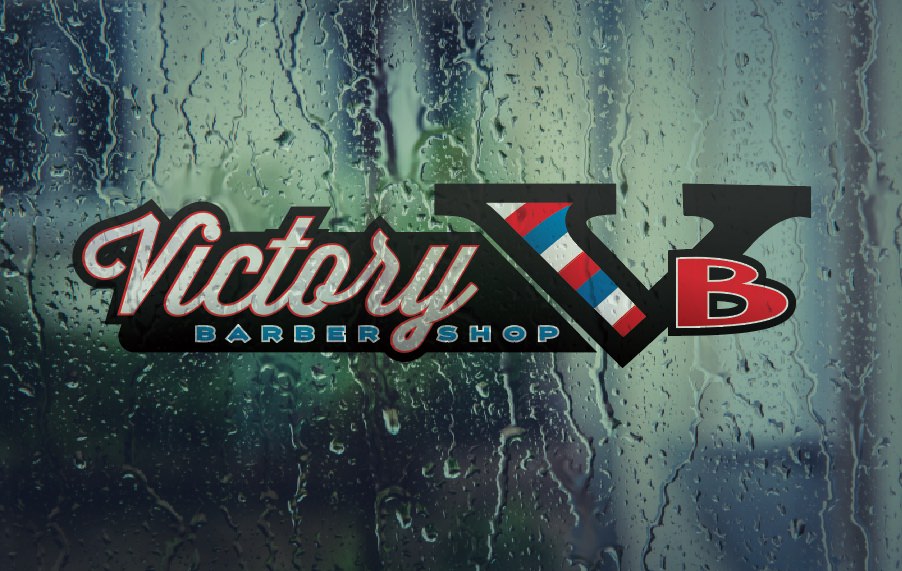
A few days back on Facebook (if you’re not following us on Facebook – first of all shame on you, and second of all, go do that here) we posted a preview of Victory Barbershop’s new custom logo, designed by us. This, is it’s story (terrible Law & Order reference).
Jacob Sullivan, master barber of 7+ years in the Portland area, and professional ginger for his entire life, used to cut our owner’s hair. Back when he had hair. He’s bald now. At a very young age, we might add. Very tragic.
Anyway, Jacob Sullivan approached us to help bring to life the idea he had for his new shop, Victory Barbershop’s, logo. They’re set to open out in Raymond Washington in August, so we set out to set Jacob up with a sweet new design.
The vision for Victory Barbershop’s logo was pretty clear when Jacob came to us. He was wanting to create a sort of spin-off from the old Commando v8 Engine emblem. This made the initial layout and “feel” phase of the custom logo design super quick and allowed us to get rolling into the fine details of font, color, and subtleties.
After all, subtleties are what sets a great logo aside form an OK logo.
Things got a little sticky toward the middle. The logo was fighting away from looking like it belonged to a retro, rockabilly-esque, but professional, barbershop.
Eventually we decided sticking too close to the old Commando emblem just made the logo too “car & racing” which gave a confusing image to a barbershop, so we simply nixed the checks in the “V” for a barber pole swirl and BOOM. We had it.
We closed up the logo and branding package like we always do, with a set of core “logos” as well as different variants in layout and color combinations for a wide range of possible uses. Included in the file were multiple file types for each color and style variant. Meaning Victory Barbershop thoroughly had every possible graphic they could ask for.
Happy wife, happy life….happy customer, happy…customer. Amirite?!
The finished custom logo


